Source: FEARNET
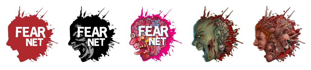
FEARNET UNVEILS BOLD NEW LOOK IN BRAND REFRESH THAT BRINGS ITS ICONIC SPLAT LOGO VISUALLY TO LIFE
Multi-Layered Marketing Campaign Is Viewer-Friendly and Offers New Ways to Engage with the Network
(SANTA MONICA – Jan. 13, 2014) – One of the strongest and most-highly recognizable network logos in the cable industry, FEARNET’s splat logo is gaining more prominence as it serves as the centerpiece of the channel’s new brand refresh, launching today. FEARNET is shedding its skin, unveiling a new network package that modernizes its former cinematic look into a multi-faceted, artful television brand, reflecting the type of diverse, genre-bending programming that FEARNET delivers. The contemporary refresh emotes a new tone and personality that is, at times, humorous and playful, exhibiting vibrant colors and sounds, and highlighting a side of the Network that many viewers—both fans and newcomers, alike—would not readily expect. With the genre acquiring more and more eyes every day, the main intent of the refresh is to open up the network for a wider audience, whether they are genre enthusiasts or general TV fans.
The brand refresh features a logo-centric identity, as the recognizable splat logo changes its form graphically in size and color for lower-thirds; programming IDs; network bugs; and banners, bringing the face in the splat to life and giving the brand a personality to match the diverse corresponding programming on-air, suitable for everything from the Network’s animated Saturday morning Funhouse Block, to more intense genre fare. The splat will transform into new animated graphics for on-air and web treatments, and will take on various forms for social media elements images and mobile apps. Moreover, the logo, itself, will become a piece of art, morphing into colorful treatments by well-known artists and fans who will be allowed to submit their own designs. The logo will also be matched with audible sound effects, providing an element of surprise for certain on-air and web applications, adding a new dimension to the image as it moves from being a static design to an on-air character.
Additionally, the refresh will present new bold graphics and an expanded color palette, adding bright neon blue, silver, gold, orange and green to the familiar red, grey, black and white hues, as FEARNET puts more focus on showcasing the elements that would not be readily associated with a genre outlet, such as the Twisted Comedy lineup, and the fan-favorite 30-Second Bunnies series, which places the titular characters into some of the genre’s best-known films. There will also be fresh merchandising opportunities and comprehensive interactive elements. These enhancements are just the beginning of a brand evolution that will continue through 2014, affecting all aspects of the company’s marketing efforts for its linear TV channel, video on demand services, affiliate communication and Industry-leading website, FEARNET.com.
“This re-brand is not about revolution, but evolution, as the channel continues to grow—creating a modern look that will satisfy the hardcore audience, while expanding its outreach to casual viewers, and cultivating new opportunities with advertisers to partner with the network,” said Faye Walker, FEARNET’s senior vice president of marketing, who spearheaded the refresh movement.
“It was important for us to maintain the same spirit that was present at the launch of the linear network in 2010,” Walker continued. “The new look is clean and confident, inspired by the multitude of ways one iconic symbol can be expressed. It maintains the classic splat logo, while being unafraid to experiment with it, inviting artists to lend their own interpretations to it for special occasions. The channel’s overall look has also been given an expanded palette, this time incorporating more unexpected vibrant colors. The new re-brand is a bold and graphic visual approach, with a modern feel that still stays true to the network’s well-known tone and texture.”
“We wanted to create a look that brings the Network into the next generation, reflecting the accelerated growth of the genre over the last few years, while also putting more focus on the eclectic programming and content that sets FEARNET apart from other genre outlets,” said Peter Block, FEARNET president and general manager. “The genre is both more accessible and more present than it has ever been, with elements like monsters, vampires, and zombies present on almost every channel. Because of this rise in popularity, we wanted to create an environment that attracts a more diverse audience—from cult classic Corman lovers, and slasher flick fans, to those casual viewers who might enjoy SLEEPY HOLLOW and THE WALKING DEAD, but do not necessarily identify themselves as ‘horror fans’.”
“We listened to both audiences and advertisers,” Block continued. “What became apparent was that the programming was more fun and colorful than the name and graphics conveyed. With this brand refresh, we wanted to lift our mask just a bit, and show a different side. I believe we’ve accomplished something special that will truly satisfy everyone.”
The creative team behind FEARNET’s clean and confident new look consisted mostly of in-house marketing executives and designers along with the guidance from a few out-of-house experts. Walker wanted to tap into her ‘genre-loving’ marketing staff, an atypical approach, to ensure that the brand reflected is what true fans favor.
To view a sizzle reel of the new marketing refresh in action, visit http://bit.ly/1cdINpA.
Courtney Mroch is a globe-trotting restless spirit who’s both possessed by wanderlust and the spirit of adventure, and obsessed with true crime, horror, the paranormal, and weird days. Perhaps it has something to do with her genes? She is related to occult royalty, after all. Marie Laveau, the famous Voodoo practitioner of New Orleans, is one of her ancestors. (Yes, really! As explained here.) That could also explain her infatuation with skeletons.
Speaking of mystical, to learn how Courtney channeled her battle with cancer to conjure up this site, check out HJ’s Origin Story.